As a digital artist, I have to do a lot of research into digital techniques for everything I do. However, it is vitally important to use real world examples and to study how these virtual renderings are achieved in “real life” in order to perfect the technique in the digital.
This is especially true of lighting. Many people think all I have to do in a digital 3D scene is put a light here or there, or just turn on the lights that are in the shot and my work is done. But there is so much more involved.
I have to understand on a deep level how real world light interacts and reacts in different situations. I have to study the play of light on a surface, how light will interact with different materials, what qualities the light takes in different situations, how the color of the light affects the scene, and that’s just scratching the surface of it.Without knowledge of these things, any 3D work I do would be an unrealistic, jarring scene with bad lighting. It can be very math heavy the more you get into it. While I could write many blogs on these topics, and I probably will eventually, I wanted to start with something general about lighting in both the real world and the digital: Why study lighting?
Without knowledge of these things, any 3D work I do would be an unrealistic, jarring scene with bad lighting. It can be very math heavy the more you get into it. While I could write many blogs on these topics, and I probably will eventually, I wanted to start with something general about lighting in both the real world and the digital: Why study lighting?
Why light?
In short, there are 10 – yes 10! – goals to lighting. Most people will instantly name one, to illuminate the scene so you can see it, but that is just the tip of the iceberg. I plan to do a series of blog posts about each of these, but this post will be an introduction to the concept of why we use lighting and in what ways.
- Establish a setting
- Enhance or creating the mood of a scene
- Direct the eye
- Create the illusion of depth
- Create the illusion of volume
- Reveal the substance and qualities of materials
- Maintain continuity
- Integrate visual elements
- Set a visual style
- Create visual interest
Now, I didn’t come up with these on my own. They’re actually all things I studied while at SCAD under the tutelage of Professor Virginia Wissler, who authored an amazing book about lighting for digital artists, Illuminated Pixels. I highly recommend this book for anyone interested in digital lighting. It provides excellent examples of every topic and shows a deep level of understanding while being easy to read.
But for now, I will briefly go over the ten goals and will dive further into them in later blog posts.
Establishing a Setting
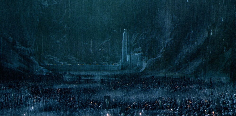
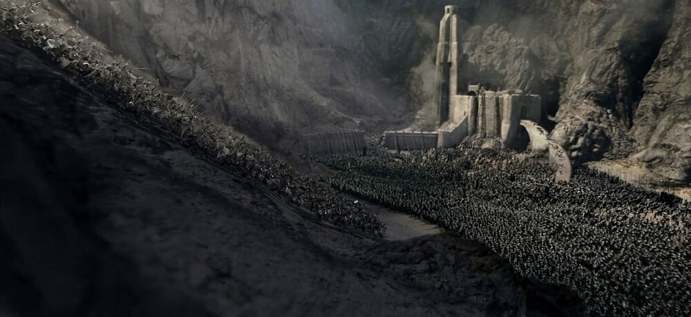
Establishing a setting is how lighting artists show where and when the story takes place. It can be divided into the Time of Day, the Weather, the Location, and even Story. Story is the overall concept that the lighting should help drive the story through the environment. For example, in Lord of the Rings: Two Towers, during the battle of Helm’s Deep, the allies are losing the battle against the Orc horde, during which the lighting is dark and overcast; then suddenly, Gandalf returns with reinforcements, just as the light breaks and illuminates the battlefield.
Enhancing a Mood
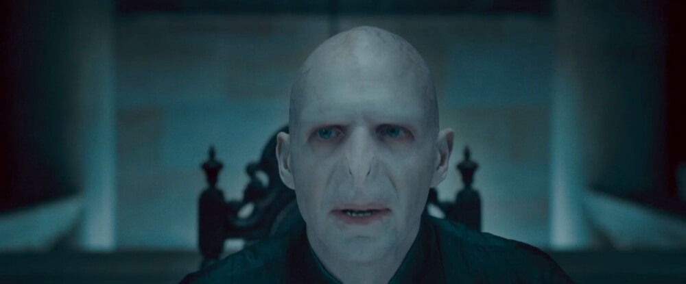
Enhancing or creating the mood is how lighters will play with the audience’s emotions directly. We can further divide this into Visual Tension, Color and Emotion, and Revealing Action or Character. This can be very complicated and uses a number of different techniques to achieve the mood the artists are going for. Sometimes it is as simple as comparing the desaturated, low-contrast, cool colors of Voldemort to the warm, contrasty, bright colors of Harry Potter.

Directing the Eye
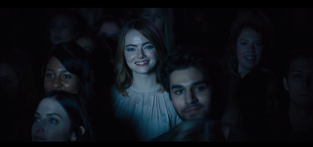
Directing the Eye can use a lot of visual trickery, and often includes many elements such as staging and composition, in addition to lighting. But what better way to tell the audience who to look at in a crowd of people than to shine a spotlight on them, such as this scene from La La Land?
Illusion of Depth
Creating the illusion of depth, volume, and revealing substances are all part of how lighting can create the illusion of dimension. Film is a flat 2D medium (yes even with stereoscopy), so lighting has to be used to create the illusion that it has a 3rd dimension to it, along with other techniques. Lighting can also be used to showcase the different qualities of the surfaces of objects, which is typically something digital artists need to worry with more than real world lighting designers.
Maintain Continuity
Maintaining Continuity and integrating elements are both part of how to provide and enhance cohesiveness to a story. Often digital elements in a film will look out of place, or one shot will seem off in a sequence of shots. This is where good lighting can come in and blend these elements and shots together, making the scene or sequence of scenes feel like they belong together.
Set Visual Style
Setting visual style and creating visual interest are all about creating the aesthetic of a film. Some films have iconic lighting, such as Sin City or Tron Legacy, while others use established techniques and styles, such as “film noir.” A director, cinematographer, or director of photography can even have a specific style of lighting that defines their career.

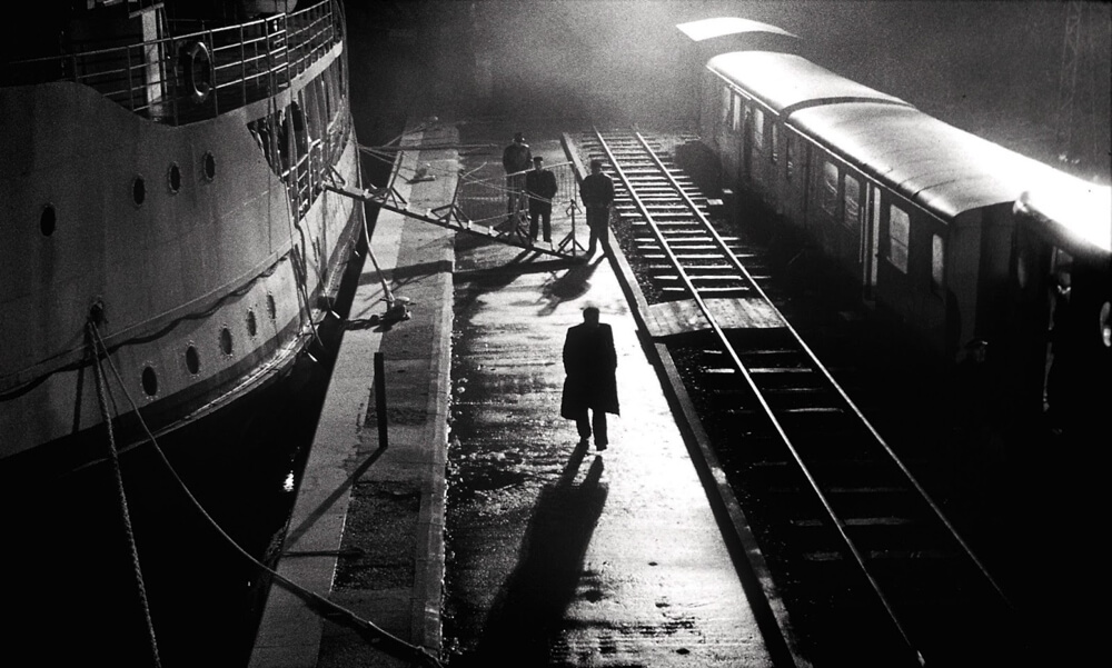
So next time you sit down to watch a movie, be it animated, live-action, or something in-between, remember that it took a team of talented artists to deliberately manipulate the lighting and look of every single shot. Look at the styles they chose, the techniques they used, and how they enhance the storytelling. Without lighting, the best-acted scene in the world would only be a black canvas.



One Response